
2012
Polyurethane with Coated Surface
h498w498d169mm
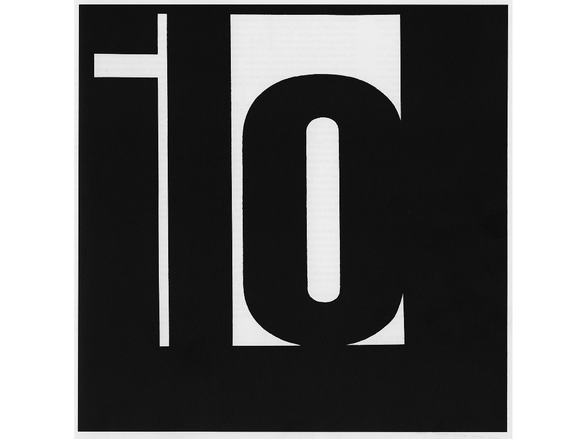
エミール・ルーダーの書籍 「TYPOGRAPHIE」 から図版を引用する。当書の19頁(6th edition 1996)に掲載されている 「ilo」 と示された図版には、以下の解説が加えられている。
右の例では、「i」 「l」 「o」 という三つの文字を組んで、明るさがはっきり異なった、大きさの違う白い面を示している。「i」 と 「l」 の間の空間はせまいが、そこはとても明るく、「o」 の内側の白地はやや弱く、「o」 の上の白地は最も弱くみえる。 白はさまざまに変化し、その原因は黒い面の大きさによっている。
この内容は、隣り合う色面との関係性により、たとえ白・黒の二色であっても目に見えない多くの階調が存在していることを示している。
これに着目し、「階調が存在するのなら、それを具体的に示すことによって活字を立体的に起こすことができるかもしれない」と想像する。
ルダーは 「i」 と 「l」 の間の空間はとても明るいと言う。この部分をハイライトと捉え、さらに紙面上で最も暗い部分を見つけ出す。そこからグレイスケールの階調を探り出し、掘り起こしていく。 「光の視点」で数値的に起こされたかたちは、活字本来のフォルムを失い、まるで建築物のように立ち現れる。
_
This work makes reference to a plate in Emil Ruder’s book Typographie: A Manual of Design. On p. 19,
we find the following explanation for the plate, titled “ilo”:
“The example on the right-hand page shows areas of white of varying sizes with clear gradations of brightness arising from the composition of the three letters. The spaces between the letters are narrow and therefore very bright, and the counter of the ‘o’ is milder, whereas the white above the ‘o‘ is the weakest of all. Variations arise in the strength of the black areas.”
This passage indicates the existence of many invisible gradations that arise from the relationship between adjoining areas of color – even two colors like black and white. By focusing on this notion, we put forward the hypothesis that if such gradations actually do exist, displaying them in a concrete manner might allow us to produce three-dimensional type. Ruder notes that the space between the “i” and the “l” is very bright. By highlighting this section, we can then discover the darkest section on the page. Then by exploring gradations within the grey scale,
we attempted to unearth this section. We anticipated that the shape, resulting numerically through a focus on light, would emerge as a kind of architectural structure bereft of its original typographical form.